Myers's Rum rebranding
This project reimagines the visual identity of Myers’s Rum through a contemporary lens while respecting the brand’s heritage and craftsmanship. The goal was to create a cohesive identity system that modernizes the brand, improves shelf presence, and clearly differentiates product variations through visual storytelling.
Understanding the Pain Points
Research revealed that while Myers's Rum carries strong heritage and brand recognition, its visual identity lacked cohesion and modern clarity. The packaging felt dated, with inconsistent typography, weak hierarchy, and minimal differentiation between flavor variations, limiting shelf impact and audience appeal. Competitive analysis showed an opportunity to refine the brand through a more structured, scalable visual system that could strengthen recognition, improve clarity, and better connect with contemporary consumers while preserving the brand’s legacy.


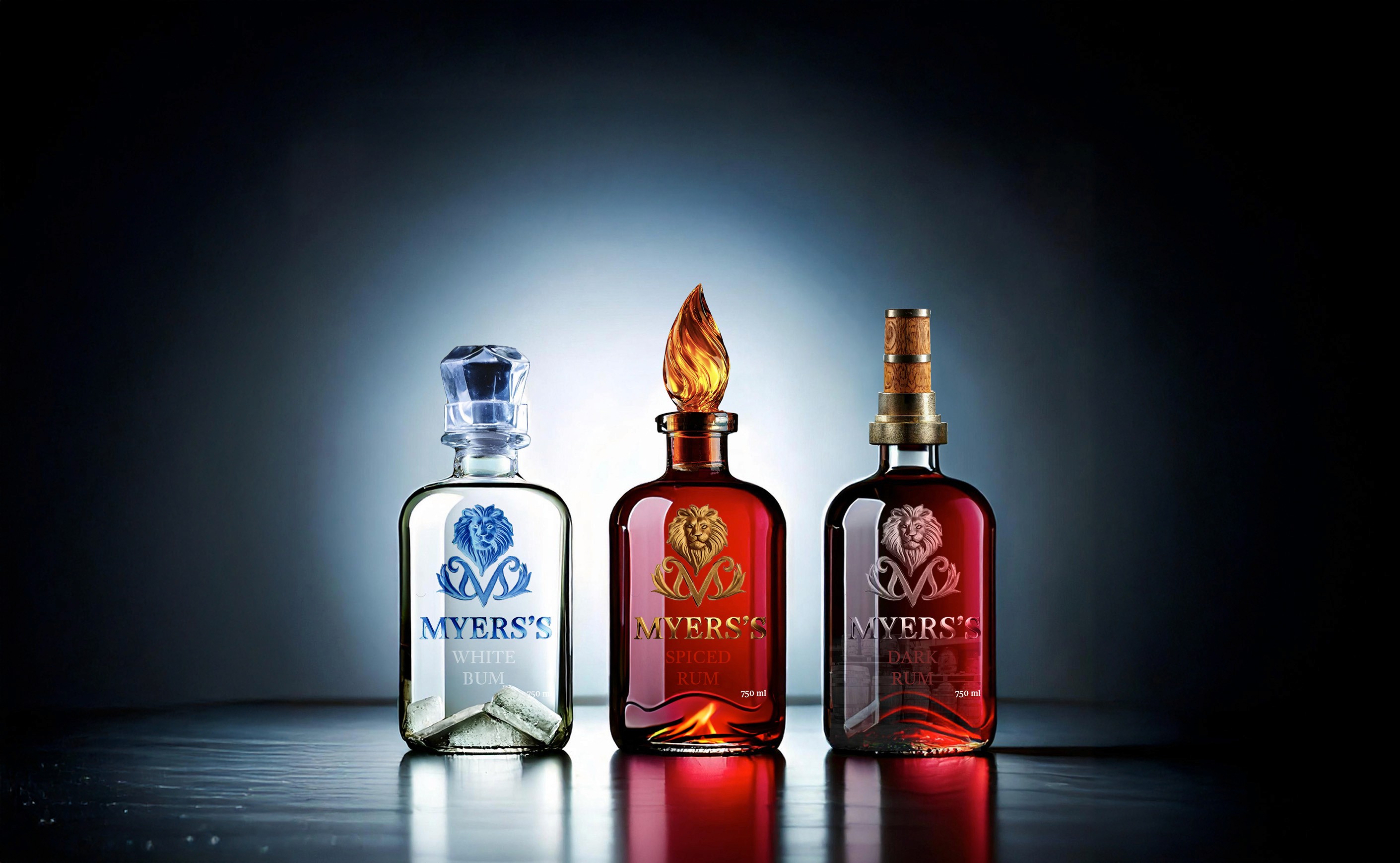
Redesigning with Intent
I began by researching the brand’s history, competitors, and market positioning. From there, I developed a structured identity system centered on strong typography, intentional color palettes, and consistent layout principles. The label designs emphasize hierarchy and clarity while allowing each flavor to maintain its own visual character.


In Conclusion
This project demonstrates how thoughtful branding and system-based design can revitalize an established product. By refining visual hierarchy, typography, and color systems, the rebrand transforms Myers’s Rum into a more contemporary and competitive brand while honoring its roots and legacy.