Victory Motorcycle rebranding
This rebranding project reimagines Victory Motorcycles as a bold, modern American performance brand. The goal was to revitalize the visual identity while preserving the strength, freedom, and heritage associated with motorcycle culture. The new system introduces a refined, scalable identity designed to feel aggressive, confident, and built for a new generation of riders.

Design Approach
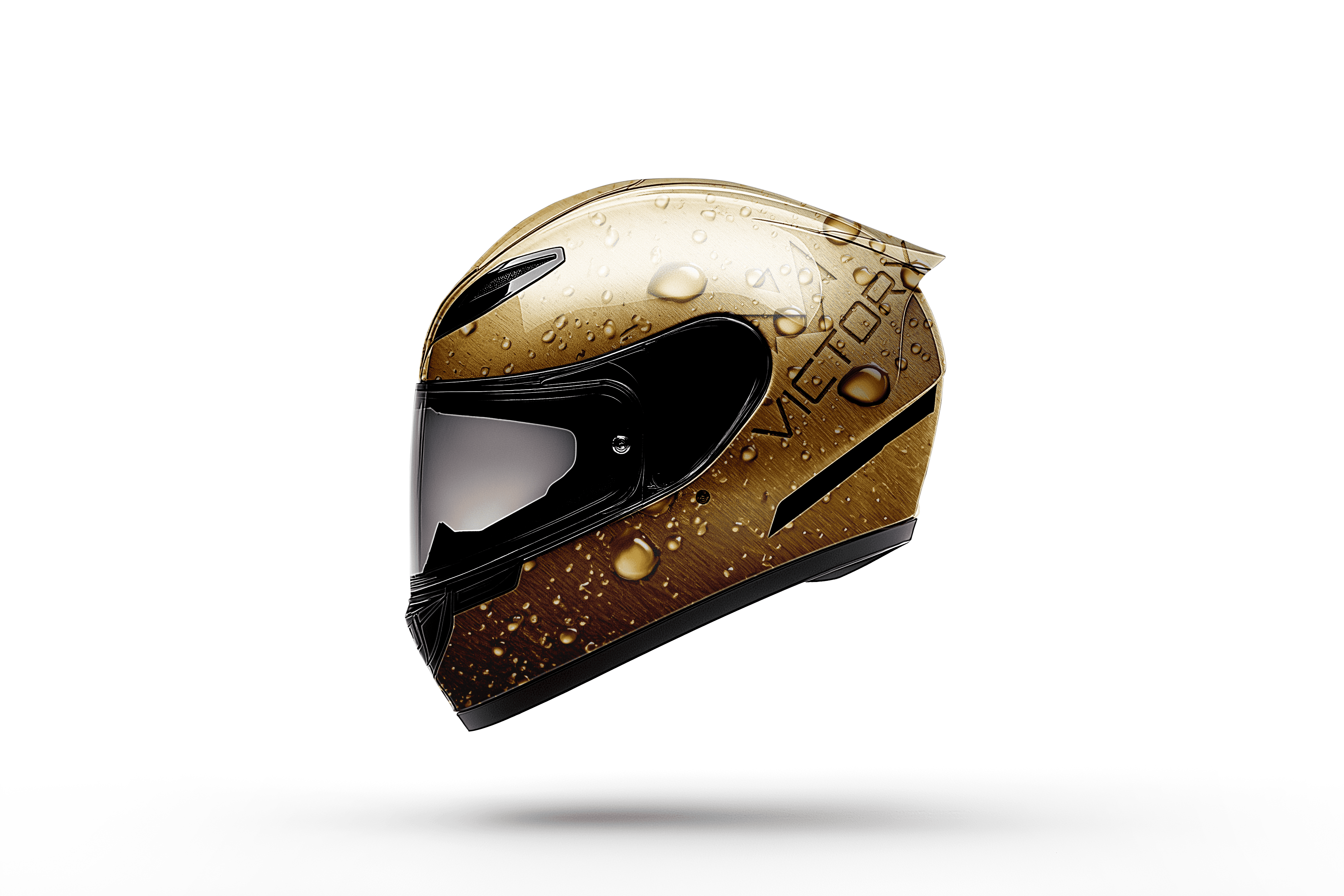
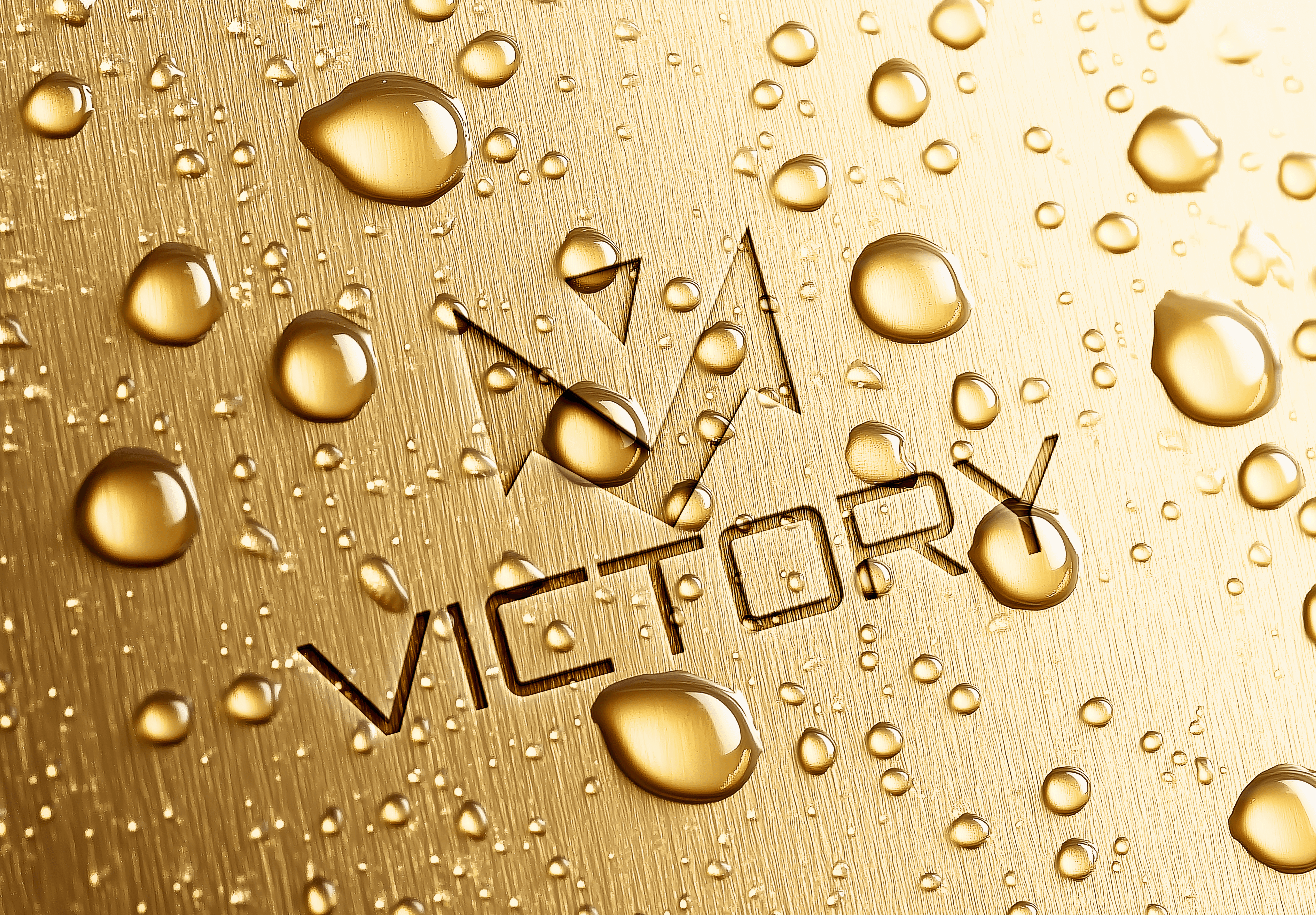
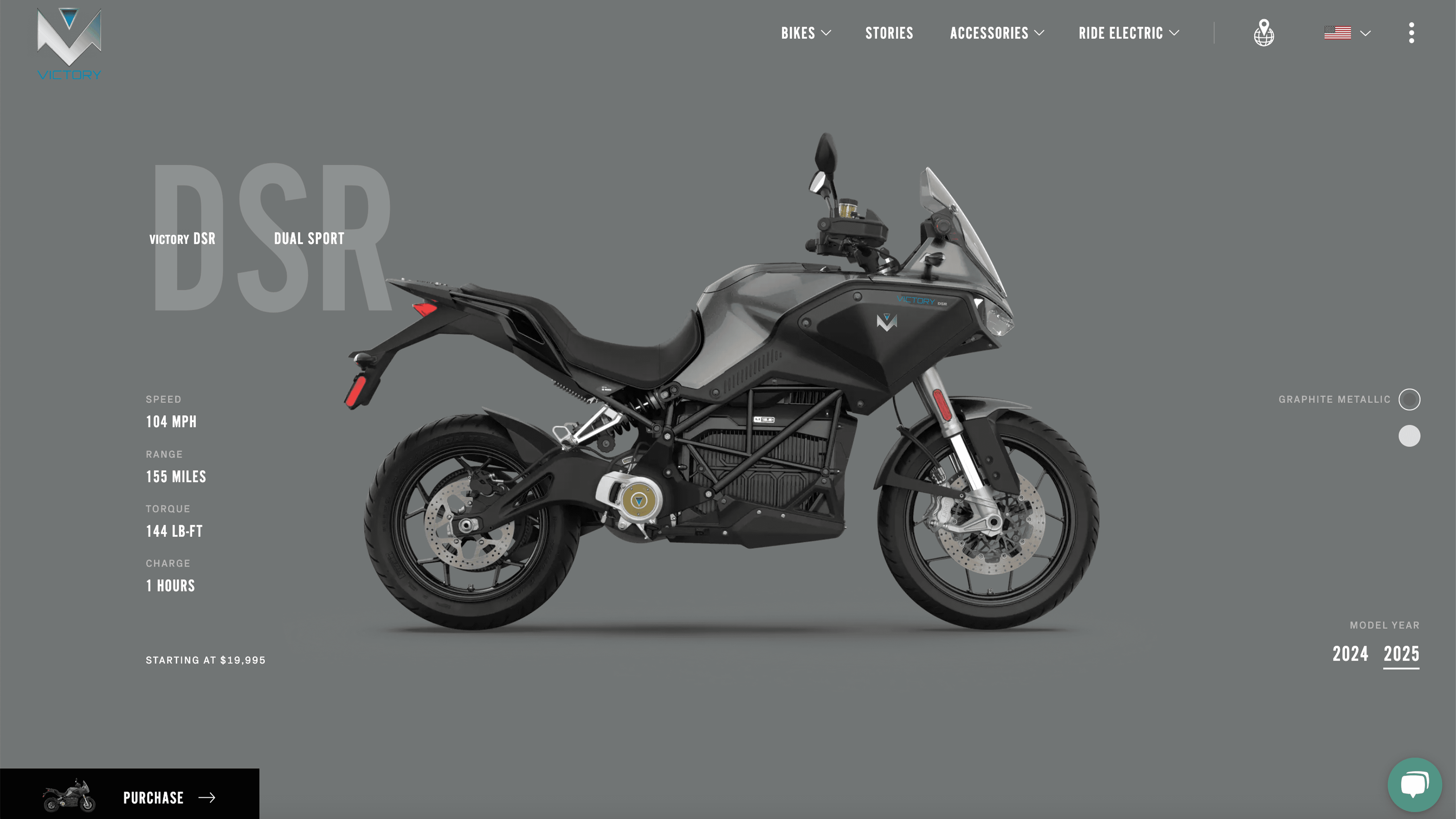
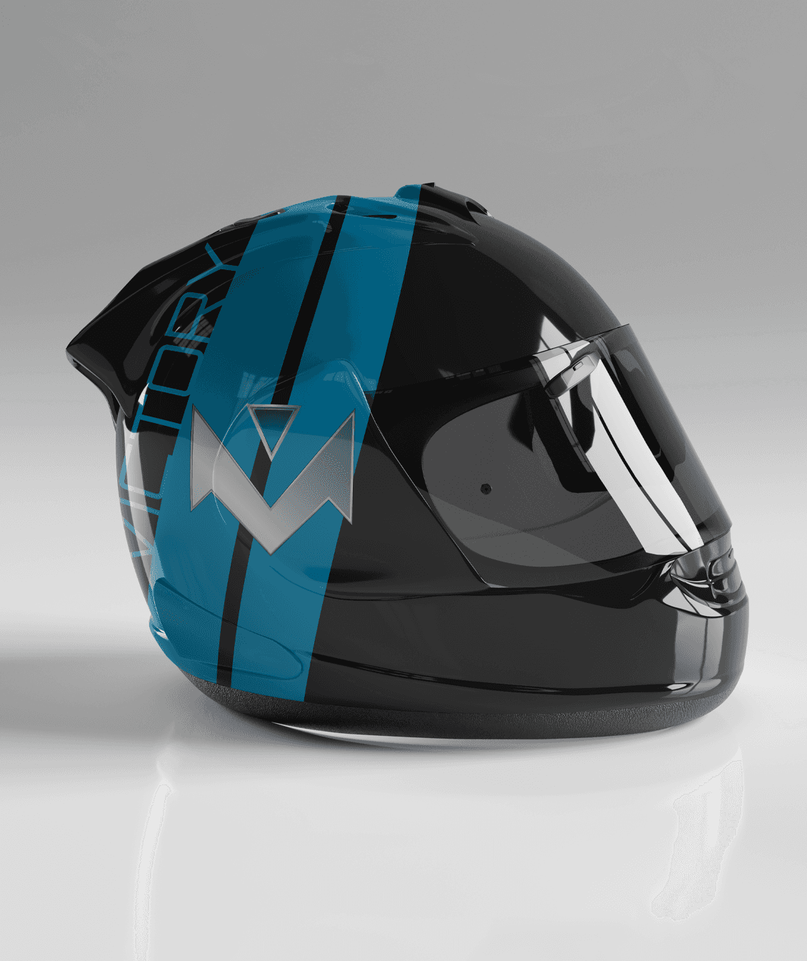
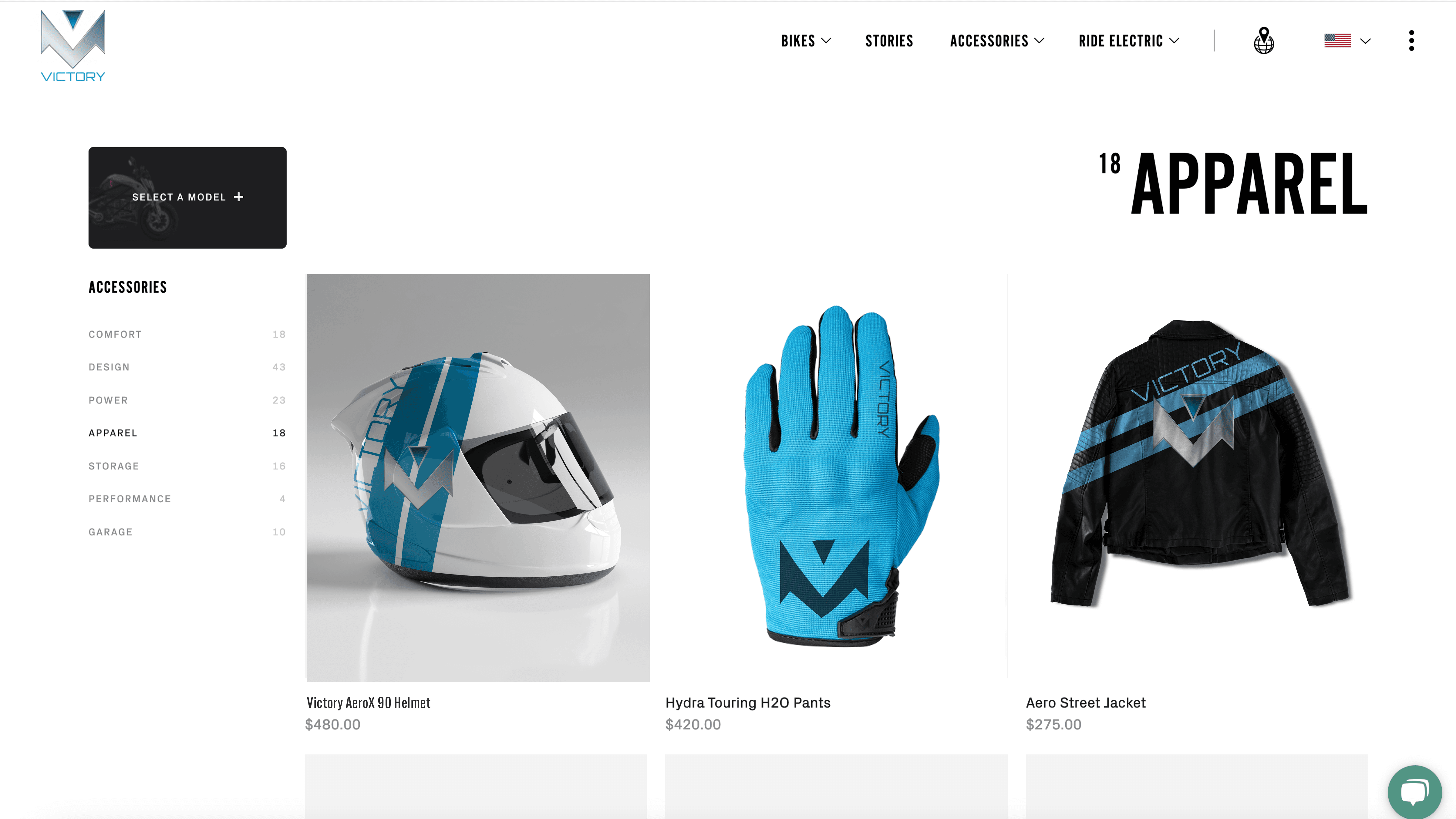
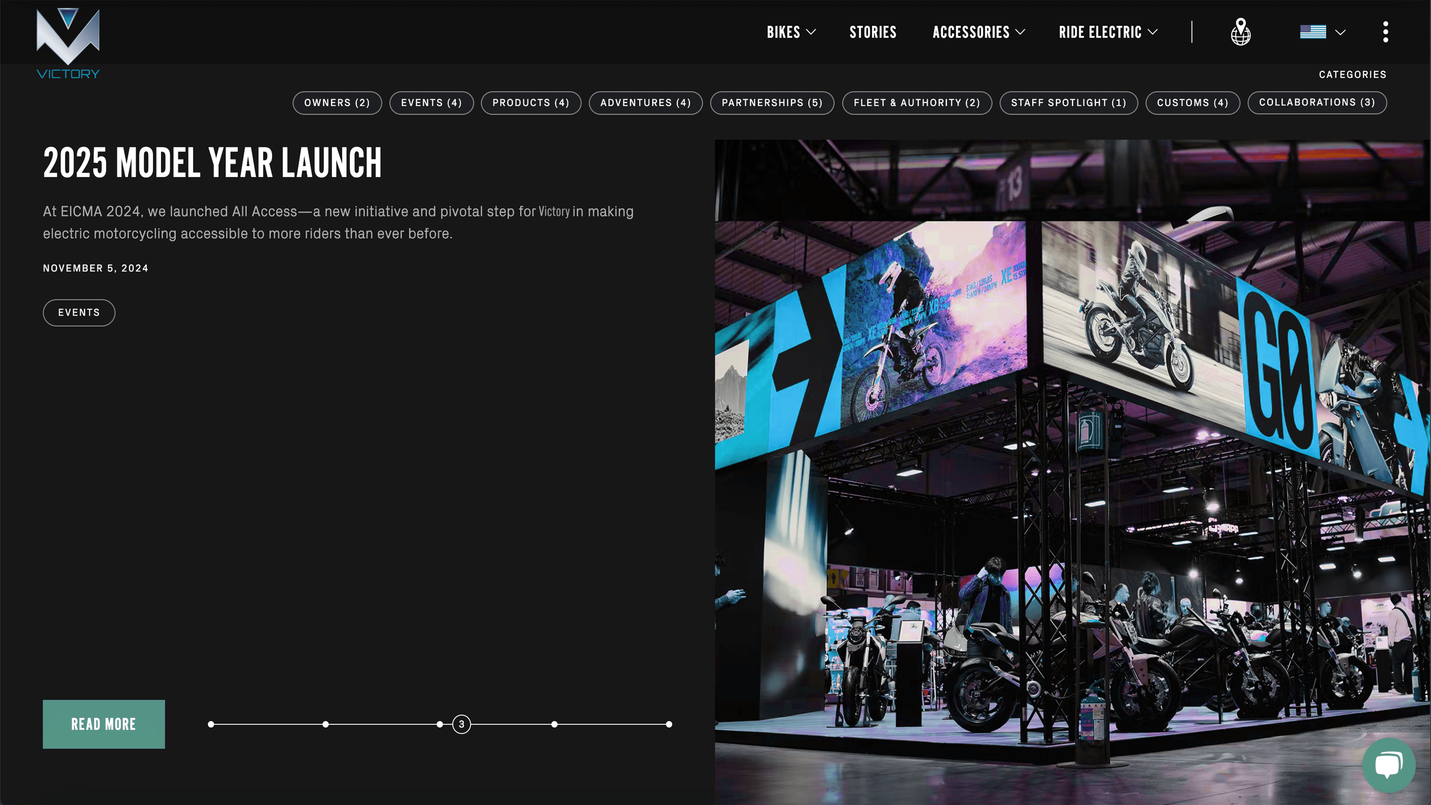
The process began with research into motorcycle culture, competitor positioning, and brand heritage. I explored multiple logo directions focusing on strong geometric forms and structured typography before refining a final mark built on balance and symmetry. The visual system extends across apparel, web design, and promotional materials, ensuring consistency and adaptability across platforms. Every design decision was guided by clarity, impact, and scalability.
Concept & Strategy
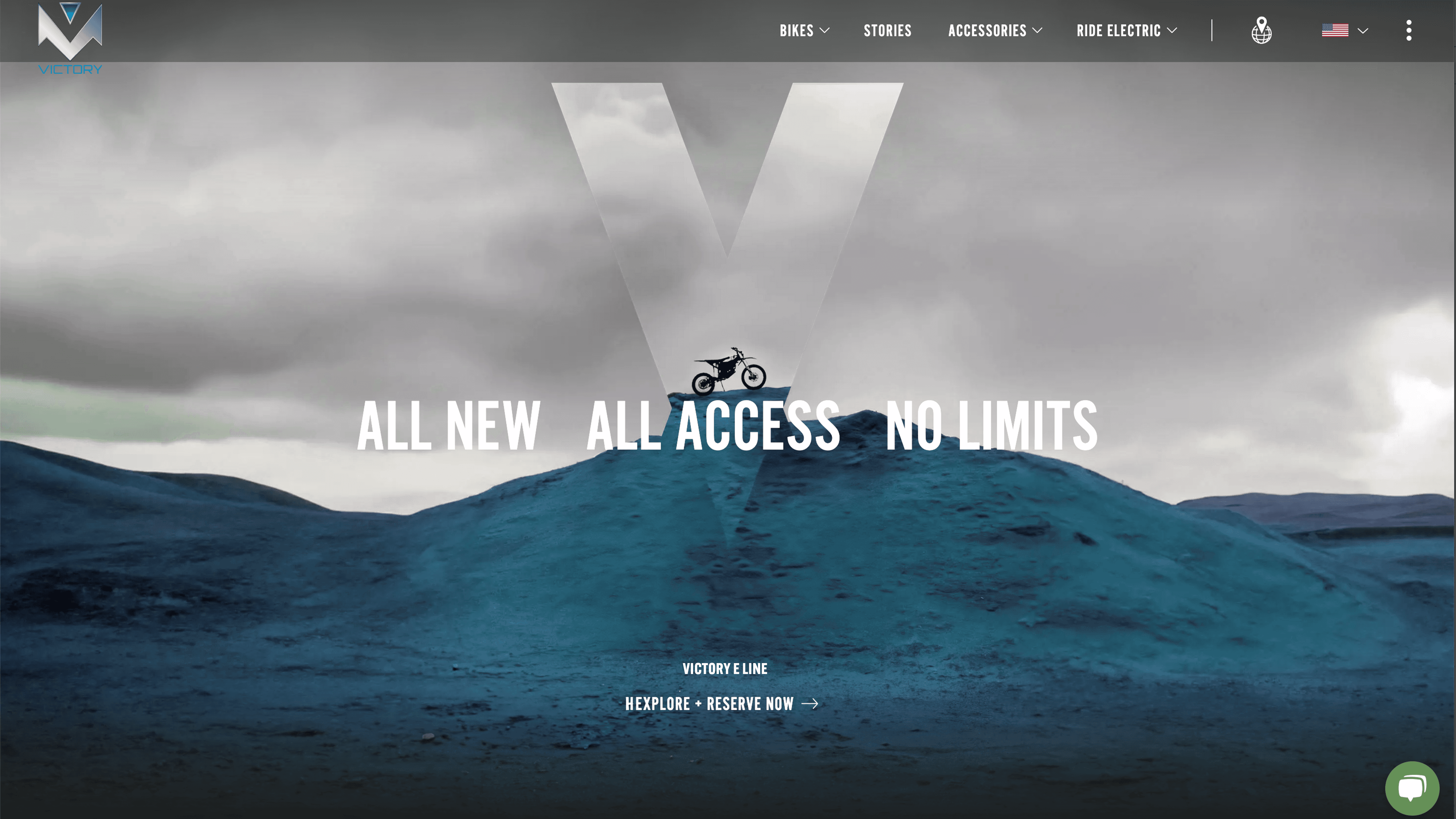
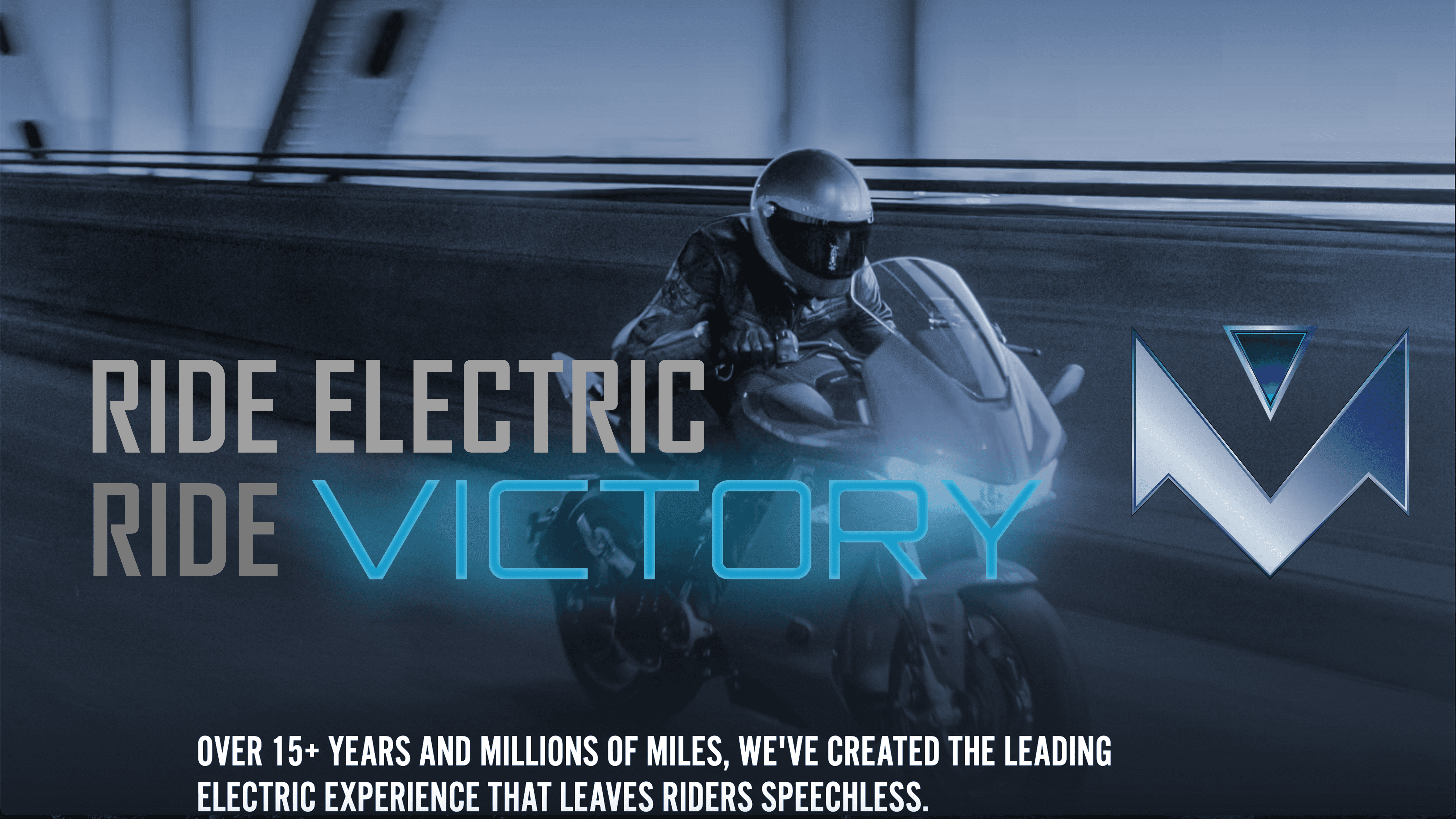
The rebrand centers on strength, precision, and motion. Inspired by mechanical structure and angular geometry, the identity system emphasizes bold typography, sharp forms, and a controlled color palette. The goal was to create a mark and supporting visuals that feel engineered rather than decorative—communicating power and performance through simplicity and structure.
Final thoughts
This project demonstrates how a structured identity system can transform an existing brand into a more competitive and contemporary presence. By refining typography, simplifying visual elements, and designing for scalability, the rebrand positions Victory Motorcycles as a confident and enduring symbol of performance and freedom.